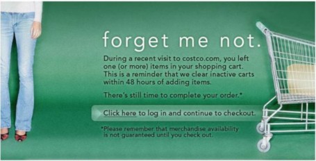
Abandoned shopping carts are a major issue for any e-commerce site. Industry sources have cited shopping cart abandonment rates ranging from 20 to nearly 60 percent.
Yesterday I was shopping on the Costco.com site and added a couple things to my shopping cart that I did not purchase. Today I received this email reminder which is a good example of a shopping cart best practice. It helps remind the customer about their potential purchase, gives a clear time-limited incentive for the customer to take action, and it also helps the company with their business goals.
In general, shopping at Costco in person is usually an enjoyable experience. Their website, however, has a ton of usability issues, especially with poor information architecture, poor site search and awkward navigation and category structure. We’ll pick on the website another day.
Most e-commerce sites are not utilizing these types of follow-up emails as a tactic to help improve their conversion, which is unfortunate since a friendly reminder seems like it would be an effective tactic to reduce shopping cart abandonment.
If anyone who is reading this has implemented this approach and has data that you can share, please share in the comments below.

No related posts.


